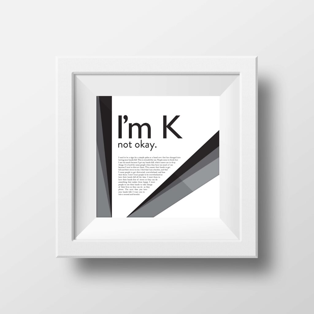
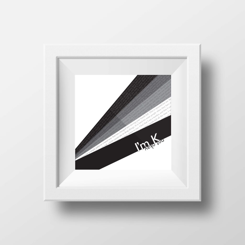
This project entailed creating a series of Letter History Posters. The topic of these designs is the history of the letter K. The decision to choose this topic stemmed from wanting to learn more about the letter K in the alphabet. The letter K represents palms and hands. People who have multiple Ks in their name are believed to have their hands full and become more overwhelmed easily. With this information, I created copy for this project. I created a poster series that had an emphasis on the symbol, the headline, and the body copy. Black and grey are very prominent in this series to display a more dramatic effect of the concept to be “ok.” Brandon Grotesque and Gill Sans are used because they are easy to read, whether the viewer is up close or looking from a distance.