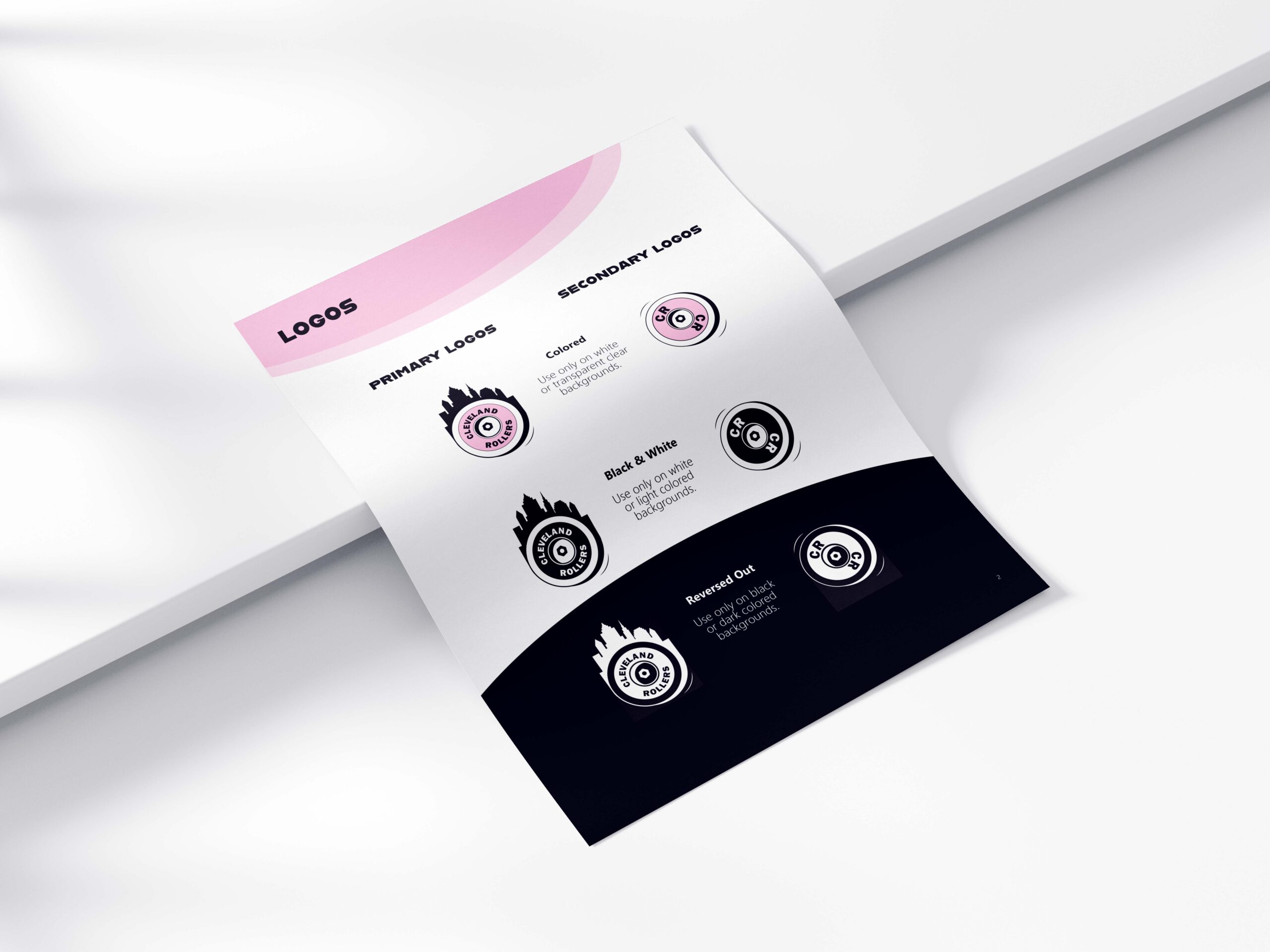
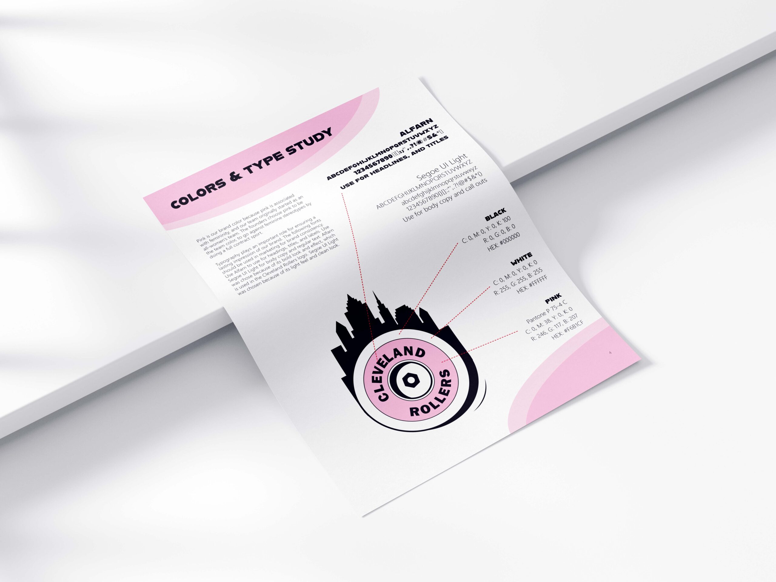
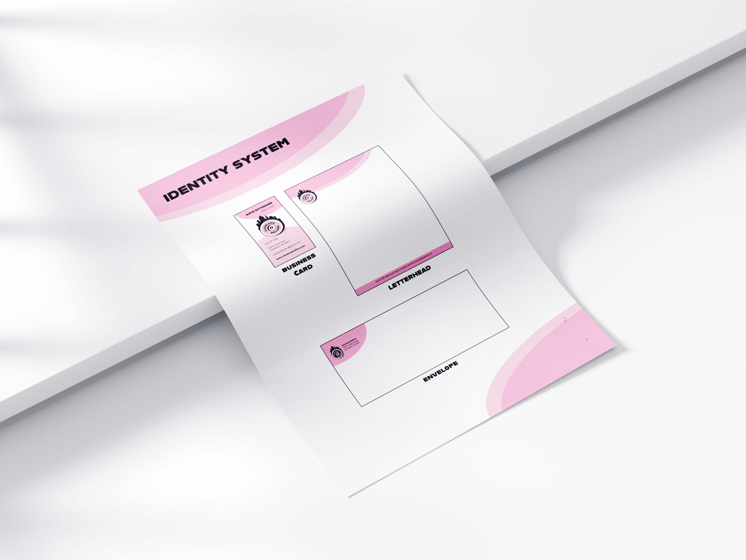
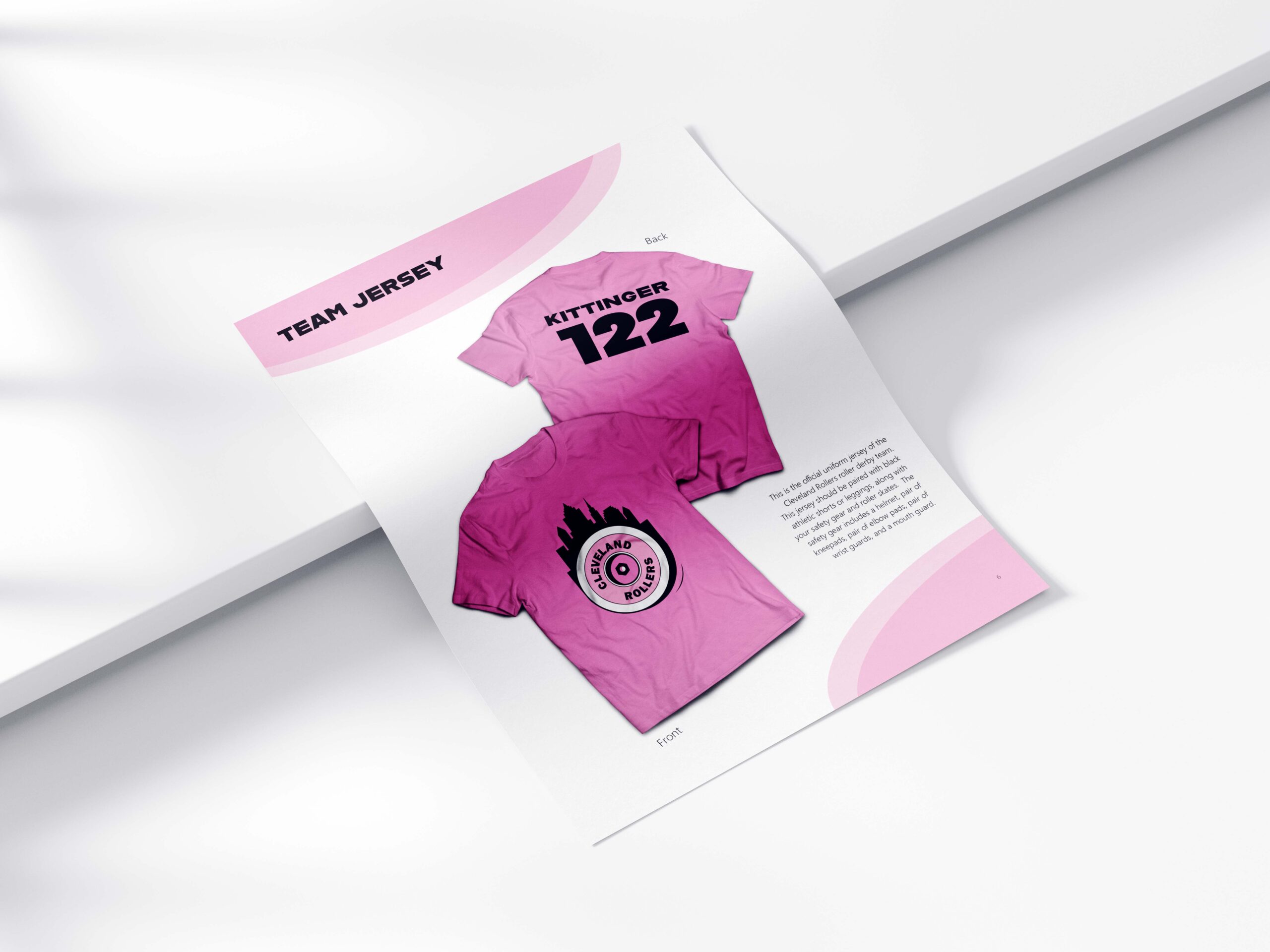
This project entailed creating a series of logos and identity guidelines for Cleveland Rollers. Cleveland Rollers is a conceptual roller derby team based in Cleveland, OH. The decision to choose this topic came from the personal experience doing roller derby. In the brand story, Cleveland Rollers is described as empowering and encouraging. The team supports their members so they can be their best mental and physical self. Pink is very prominent in Cleveland Rollers branding because it shows its feminine roots of when the team was first created it was an all-women’s team. Pink symbolizes love and Cleveland Rollers promotes self-love. The brand’s logos all include a wheel and nut to symbolize the sport they play. Alfarn Regular is present in the logo. It is also used to make heading and titles pop. Segoe UI Light is used as body copy because it is easy to read.
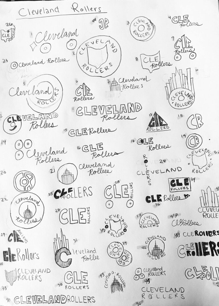
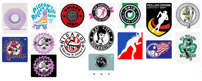
This project required me to research of roller derby teams to be able to efficiently create a logo for Cleveland Rollers. My inspiration, research, and thumbnails are below.